
Why this piece exists
When building software becomes easy, the question is no longer can you build it. It is do you understand what is worth building.
This piece is a demonstration of that idea. It is not a client engagement — it is a self-directed exploration, built to show how a framework turns a vague brief into a precise product decision.
The brief I gave myself was deliberately ordinary: a mobile app to help a pharmacist with ordering. The kind of brief anyone could now hand to an AI tool and get screens back in minutes.
The point of this piece is everything that has to happen before those screens — the judgment an AI does not provide, and a generic prompt cannot replace.
Reframing the problem
A junior brief reads: “a stock management app for pharmacies.”
That brief is already a wrong answer disguised as a question.
A pharmacist who runs out of a product simply reorders it. That is routine. It does not need an app. If I had accepted the brief as written, I would have designed a digital inventory sheet — and solved a problem nobody has.
So the first move was to find the real problem.
An experienced pharmacist does not lack information. He knows his trade. What he lacks is the time and the instrument to turn his intuition into a precise, quantified ordering decision. He decides by feel. The feel is good — but imprecise.
The reframed problem: The app should not manage stock. It should make the pharmacist’s intuition precise.
That single reframe changed everything downstream. It is the difference between an app that counts boxes and an app that helps a professional decide.
The central tension
A good product is designed around a real human conflict, not a generic user.
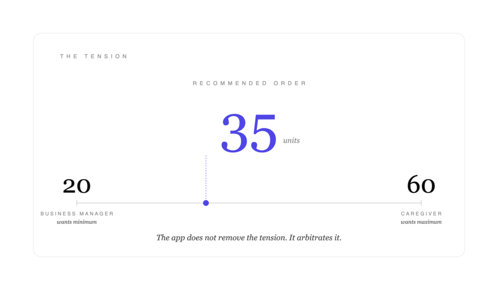
Behind the ordering decision sits one permanent tension. The pharmacist is two people at once.
The caregiver wants every medicine in stock, always. To him, a stock-out is not a line in a table — it is a patient who leaves without treatment.
The business manager knows every box on the shelf is immobilised cash, and that medicine expires. To him, over-ordering is money lost.
These two never fully agree. Every order is an arbitration between them — between the risk of overstock and the risk of shortage.
This tension became the spine of the whole design. The app does not pretend to remove it. No tool can. The app helps the pharmacist hold the tension — to arbitrate it with more precision, more confidence, and less regret.
Deciding the method
Seniority is not knowing every UX deliverable. It is knowing which ones the problem actually needs — and having the discipline to discard the rest.
For this project, the method decisions were explicit:
Kept — a single, deep persona built around the central tension. Decision flows, structured with the Decision Compass. A focused set of user stories tied directly to those flows.
Discarded — the journey map (this app is a concentrated decision moment, not a journey spread over time). The empathy map (it would duplicate the persona). The service blueprint (there is no multi-actor complexity here to justify a heavy deliverable).
Added — a trade-off matrix. A custom deliverable, in no textbook, built because this specific problem demanded it.
The result was not less work. It was work aimed only where it mattered.
The decision flow
The app’s structure is not a sequence of screens. It is a sequence of mental states — how the pharmacist moves from uncertainty to a decision he trusts.
It follows the Decision Compass, three layers, in order:
Layer 1 — Information. On opening, the app shows only the products that need a decision today — never the full stock. A short, calm list. It respects the pharmacist’s limited time.
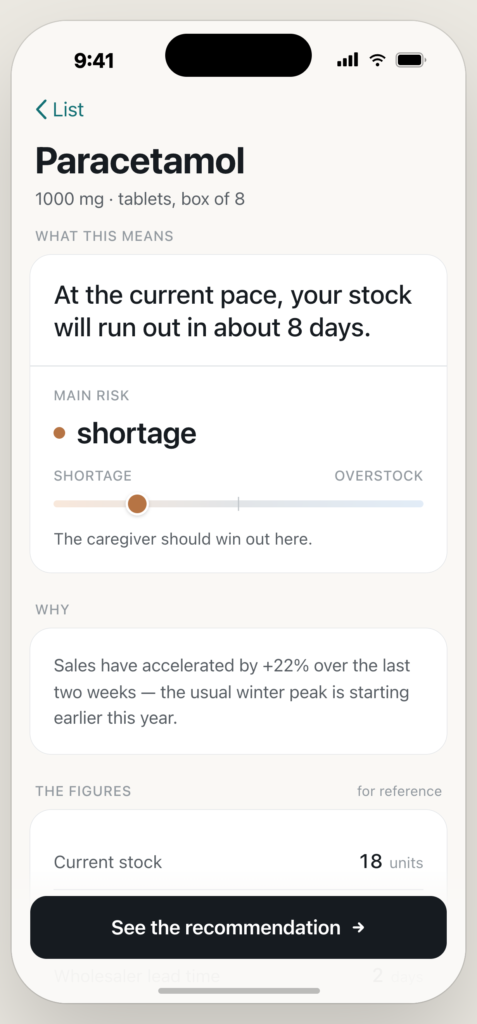
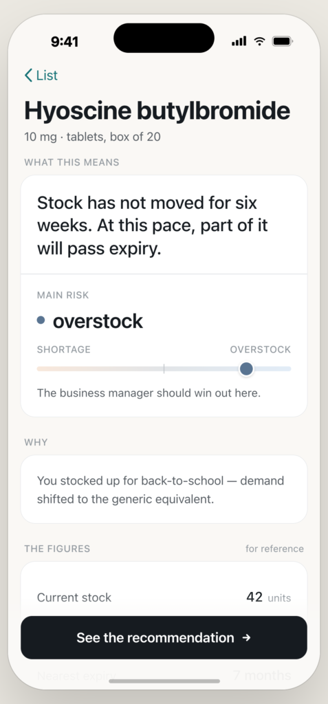
Layer 2 — Insight. When he selects a product, the app does not show raw numbers. It translates them into meaning — and names which side of the tension currently dominates: shortage risk, or overstock risk.
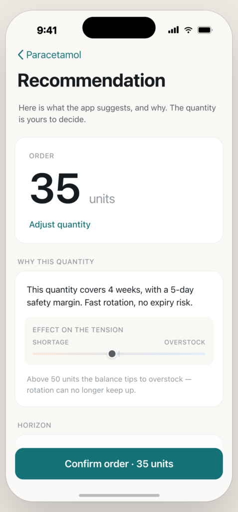
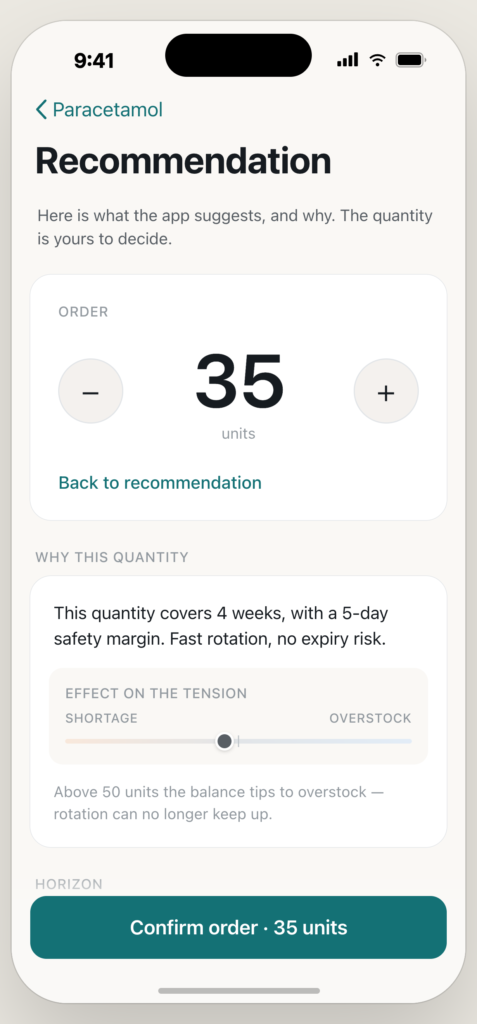
Layer 3 — Action. The app proposes a precise quantity, with the reasoning behind it. The pharmacist validates in one gesture, or adjusts it himself. The app proposes — the pharmacist decides.
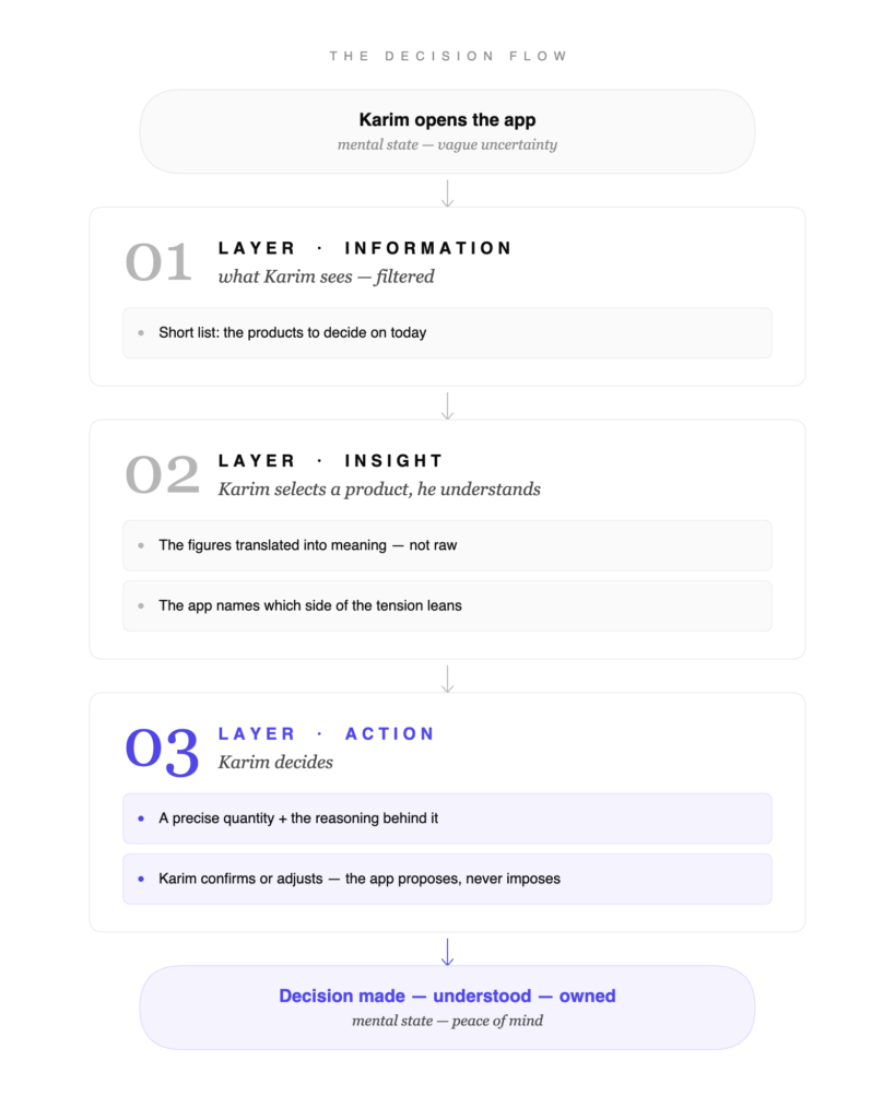
The lower layers are never the focus. They are evidence. The decision is the surface.
The logic behind the number
Most design work stops at the screen. But a screen that recommends “order 35 units” is only credible if there is a defensible logic behind the 35.
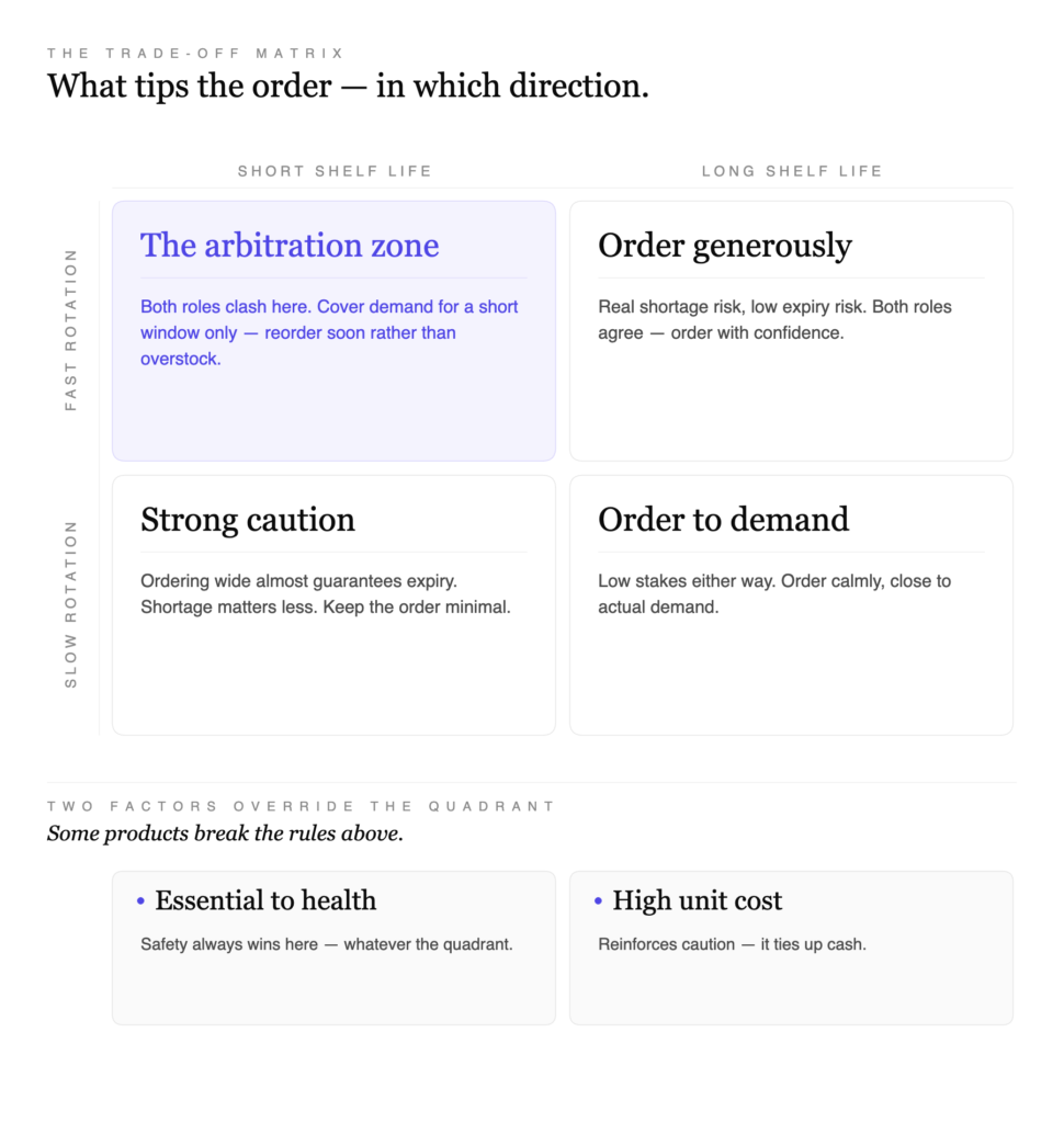
That logic is the trade-off matrix — the deliverable that designs the decision behind the interface.
It maps the factors that tip the tension one way or the other: how fast the product sells, how quickly it expires, how essential it is to patient health, how much cash it ties up.
Crossing those factors produces a clear orientation for each situation. A fast-selling, long-keeping product leans toward generous ordering — both sides of the tension agree. A slow-selling, fast-expiring product leans hard toward caution. A product that is vital to a patient’s health leans toward safety, whatever its sales rate — here the caregiver must win.
This matrix is what gives every recommendation in the app a reason the pharmacist can see, understand, and trust.
The interface
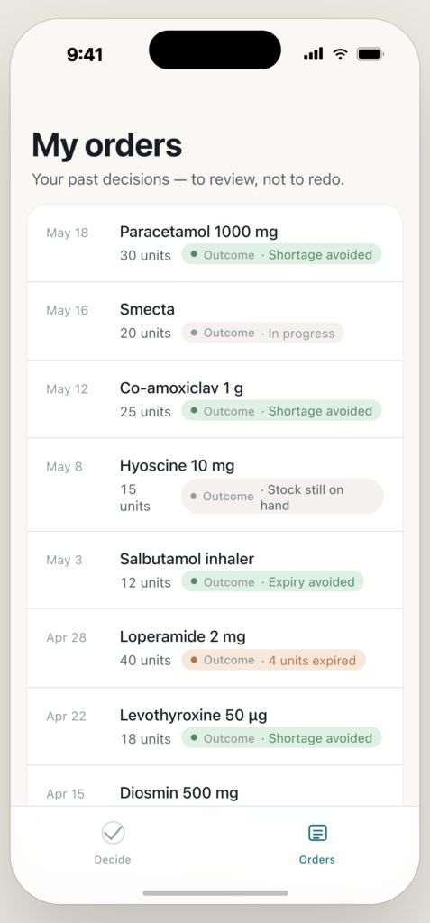
Only at this point — after the framing, the tension, the method, the flow, and the decision logic were all settled — did the interface get designed.
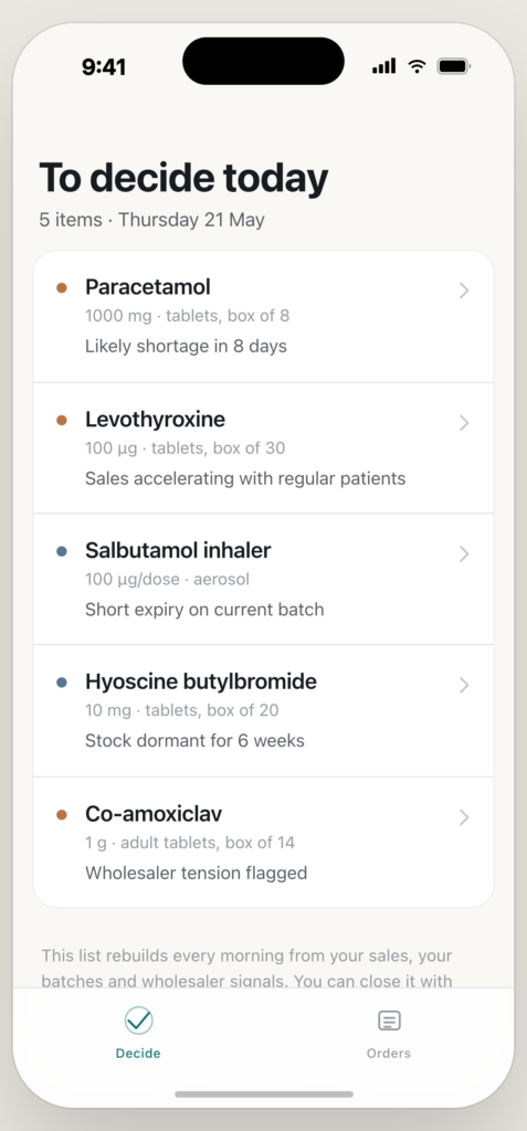
The screens are the visible tip of the work. Every choice in them traces back to a decision made earlier:
The calm home screen, showing only what needs a decision — because the persona is short on time. The insight screen, naming the dominant risk — because the tension must be visible, not hidden. The recommendation, always editable — because the app proposes, and the professional decides.
What this demonstrates
Anyone can now generate these screens from a prompt.
What cannot be generated is the chain of judgment beneath them — reframing the problem, naming the tension, choosing the method, structuring the decision, designing the logic behind the number.
That chain is the work. The interface is only where it becomes visible.
This is what the Decision Compass is for: not to make software look better, but to make sure that what gets built is the thing worth building.