
Context
The challenge
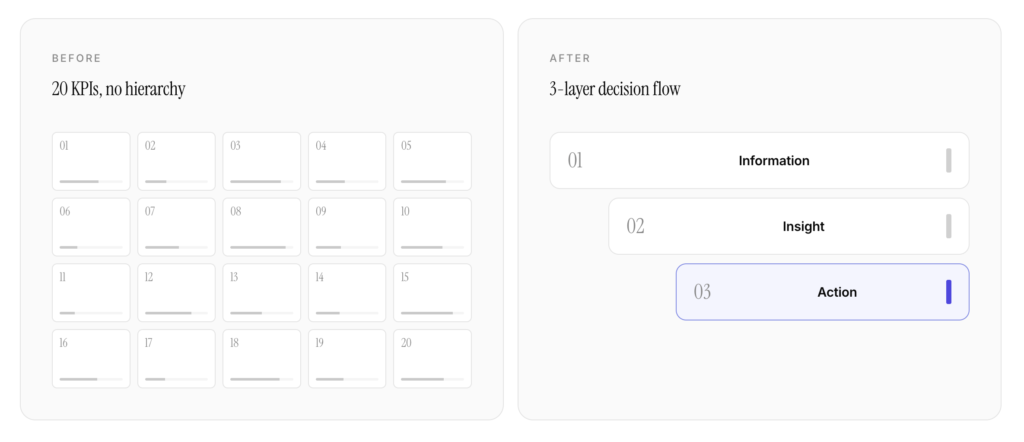
The client operated a sales-tracking ERP module used daily by regional sales managers across the Gulf. The dashboard, originally designed by their internal product team, had accumulated 20 KPIs over three years of feature additions.
Each KPI was technically valuable. Together, they created paralysis.
Sales managers reported opening the dashboard multiple times per day but rarely acting on what they saw. Most decisions were still made via Excel exports or WhatsApp conversations between regional heads. The ERP had become a system of record — not a system of decision.
The dashboard had everything. It just didn’t help anyone decide anything.
— A regional sales manager, during initial research
Research
What we discovered
Over the first three weeks I ran eight stakeholder interviews with sales managers, three sessions with regional heads, and two working meetings with members of the product team. Each conversation was paired with a moderated walkthrough of the existing dashboard, with participants thinking aloud as they tried to answer real operational questions from their week.
In parallel, I ran a cognitive-load analysis of the dashboard’s information architecture, and mapped the actual decision flows users followed — including the points where they abandoned the tool in favour of Excel or chat.
Three findings consolidated across all of it.
Information ≠ Decision
Users had 20 metrics but no hierarchy. Every KPI competed for equal attention.
Mental load was the real bottleneck
The cognitive cost of interpreting raw data pushed users toward external tools.
The dashboard answered the wrong question
“What happened?” instead of “What should I do?”
Approach
Reframing through the Decision Compass
Rather than redesigning the dashboard surface, we reframed its purpose. The Decision Compass — a three-layer model I had developed across previous engagements — gave us a structure for separating what the system knows, what it means, and what it asks the user to do.
Each layer became a distinct surface in the dashboard, with its own visual weight, its own interaction model, and its own success metric. The work that followed was less about adding components and more about deciding what each layer should and should not contain.
Layer 1 · Information → curated, not exhaustive
The bottom layer kept the raw KPIs but stopped pretending they were all equal. We grouped the original 20 indicators into four operational families — pipeline, conversion, velocity, and risk — and pushed the rest of the long tail into a secondary panel reachable on demand.
Crucially, this layer became something users can consult, not something they must. The default view no longer surfaces every number; it surfaces the ones that have changed enough to matter.
Layer 2 · Insight → meaning over data
Above the raw signals, the insight layer translates numbers into relationships. Each metric is shown against its own historical baseline, the regional average, and the period’s target. Deviations that cross a threshold are flagged, ordered by their estimated revenue impact rather than by alphabetical or alphanumeric position.
This is the layer that finally answers “is this normal?” — a question the prior dashboard left entirely to the user.
Layer 3 · Action → the decisive top
The top layer surfaces, at most, three prompts: a recommended action tied to the most material insight, a follow-up question for the user’s team, and an optional escalation. Each is one click from the relevant evidence underneath.
In testing, this single layer absorbed almost all of the user’s attention. Once present, it changed how the lower two layers were read — as supporting context, not as a checklist.
Outcomes
What changed
The redesign shipped at the end of the eighth week and was rolled out to a pilot of twenty-six sales managers across three regions. Quantitative figures below are the team’s own internal estimates, collected over the first three months of use.
Estimated reduction in time-to-decision per session
Increase in self-reported confidence among sales managers
From flat KPI list to layered decision flow
The redesign didn’t add features. It removed friction. The data didn’t change — what changed was how users perceived, prioritized, and acted on it. Three months after launch, the client reported that sales managers had stopped requesting Excel exports.
Reflection
What this taught me
Most enterprise UX problems aren’t UI problems. They’re architecture problems disguised as UI problems.
This engagement reinforced something I now bring to every project: the goal isn’t to make complex systems beautiful. It’s to make them decisive.
Beauty comes after. Or sometimes — when the system is honest about its purpose — beauty just shows up on its own.